UI In Design Guide: Essential Concepts for 2025

Hey, I'm James, Founder of Embark Studio and Digital Product Designer.
With over 15 years of experience, I've helped businesses transform their digital presence through stunning websites and smart, scalable design solutions.
In 2025, a great UI design site isn’t just eye candy—it’s a competitive advantage. We’ve curated the 10 best platforms for fresh layouts, real-world patterns, and community insights to keep your work sharp and future-ready.
In 2025, digital products rise or fall based on the strength of their user interfaces. An intuitive, beautiful UI can be the deciding factor between loyal users and lost opportunities.
This guide is your roadmap to mastering ui in design for the modern era. Whether you're a designer, founder, or product leader, understanding these concepts is critical to building high-performing interfaces that stand out.
We’ll break down the foundations, explore the evolving relationship between UI and UX, highlight new design principles, share essential tools, and provide strategies for creating interfaces that delight users and drive measurable results.
The Foundations of UI in Design: What Every Designer Must Know
User interface is the first handshake between your product and its audience. In the rapidly evolving digital landscape, understanding the foundations of ui in design is crucial for anyone aiming to build products that not only look appealing but actually work for users. Let’s break down what truly matters at the core of effective UI.
Defining UI: More Than Just Visuals
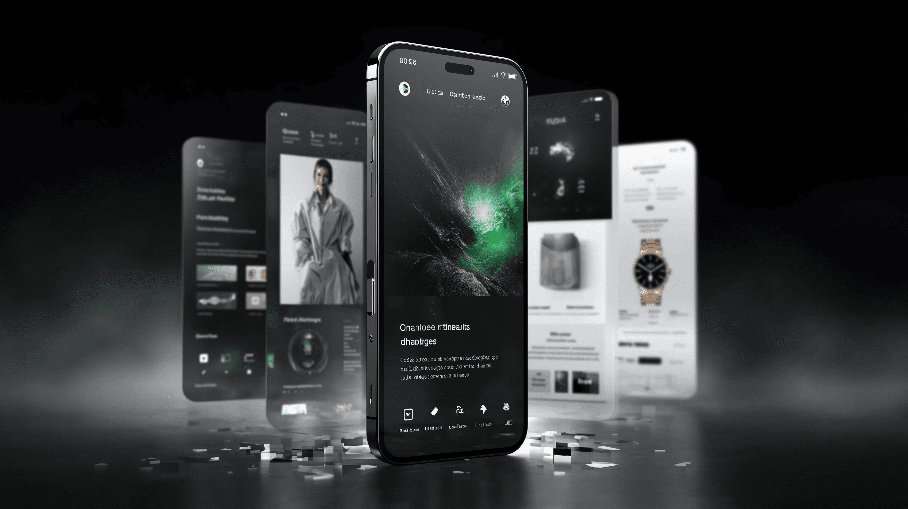
At its essence, ui in design is about creating the interactive layer where users and digital products meet. It’s not just about pretty screens—it’s about how people move through websites, apps, and devices. The UI includes four primary elements:
UI Element Type | Examples |
|---|---|
Input Controls | Buttons, checkboxes, dropdowns |
Navigational Components | Menus, sliders, tabs |
Informational Elements | Notifications, progress bars |
Containers | Cards, accordions |
Think about booking a flight on your phone: every tap, swipe, and menu selection is guided by UI components. These first impressions happen fast—users judge a site’s credibility in less than 0.05 seconds. For a deeper dive into the foundations and best practices, you can explore UI Design Best Practices for 2025.
The Pillars: Interactivity, Visual Design, and Information Architecture
The strength of ui in design rests on three pillars:
Interactivity: How does the interface respond to users? Hover effects, button clicks, and swipe gestures all shape the experience.
Visual Design: Color, typography, iconography, and imagery create mood and clarity. Spacing and layout keep things organized and accessible.
Information Architecture: Content needs structure. Labeling, grouping, and navigation help users find what they need quickly.
Look at Airbnb’s homepage: the clean layout, inviting visuals, and clear navigation make it easy to start a search or browse listings. Each pillar works together, ensuring the UI is both attractive and functional.
Why UI Matters: The Link to User Experience and Business Goals
Why invest in ui in design? Because it’s directly tied to your product’s usability, accessibility, and brand perception. A seamless UI removes friction, making it easy for users to complete tasks. This has a direct impact on business metrics: well-designed interfaces can boost conversion rates by up to 200%.
UI also plays a huge role in customer retention and satisfaction. Users remember how fast and simple it was to get things done—not the design details. The best UI is almost invisible, letting users focus on their goals instead of the interface.
Key Arguments and Insights
Here’s the truth: ui in design isn’t just about looking good. It’s about making things work—reducing cognitive load, building order from chaos, and supporting user expectations. Effective UI design covers all digital touchpoints, from desktop screens to wearable devices.
To truly excel, designers must study user behavior and stick to patterns users already know. The strongest interfaces are those that help people accomplish tasks effortlessly, proving that the real power of UI lies in its ability to disappear when it matters most.
UI vs. UX in 2025: Understanding the Critical Differences
In the world of digital products, understanding the difference between UI and UX is essential. Many confuse the two, but each plays a unique role in the success of any project. Let’s break down how these disciplines interact and why mastering both is critical for effective ui in design.

Clarifying the Roles: UI as Interior Design, UX as Architecture
Think of ui in design like decorating a hotel room, while UX is the blueprint of the entire building. UI determines how everything looks and feels—the colors, buttons, and icons users interact with. UX, on the other hand, shapes the journey, making sure the structure and flow are logical and satisfying.
Here’s a quick comparison:
Aspect | UI in Design | UX (User Experience) |
|---|---|---|
Focus | Visual interface | Overall experience |
Scope | Screens, buttons | Structure, journey |
Analogy | Interior design | Architecture |
Example | Button style | Task flow |
For example, when using a banking app, ui in design ensures that the buttons are easy to find and the color scheme is inviting. Meanwhile, UX ensures that transferring money is a simple, stress-free process.
How UI and UX Collaborate for Seamless Products
The best digital products are born when ui in design and UX work together seamlessly. UX teams research user needs and map out journeys, while UI teams bring those journeys to life with compelling visuals and interactions.
Consider these collaboration steps:
UX research identifies what users want to achieve.
UI designers create layouts and visuals based on those findings.
Both teams test prototypes to refine the experience.
This teamwork ensures that ui in design not only looks good but also supports usability and accessibility. It’s important to remember that 88% of users are less likely to return after a bad experience, so alignment between UI and UX is non-negotiable.
Common Misconceptions and Overlaps
A frequent misconception is that ui in design is simply a subset of UX. In reality, they are distinct but deeply interconnected disciplines. Good UI cannot make up for a flawed UX, and even the most logical UX can’t succeed without appealing UI.
Hybrid roles are emerging, but clear role definitions still matter for quality results. For a deeper dive into how these fields compare and collaborate, check out UI vs UX Design: What's the Difference?.
Key Arguments and Insights
For anyone working in ui in design, understanding these differences is non-negotiable. Clear division of responsibilities leads to more effective products. UI designers benefit greatly from a foundation in UX, as both aim to create experiences that are usable, accessible, and delightful.
Ultimately, ui in design and UX share a mission: to help users accomplish their goals with ease and satisfaction. When both are prioritized, digital products stand out in 2025.
Essential UI Design Principles for 2025
Mastering ui in design principles is non-negotiable for digital success in 2025. As users encounter more digital products than ever, their expectations for seamless, intuitive experiences keep rising. Whether you’re redesigning a legacy platform or launching something new, these principles offer the foundation for interfaces that not only look great but truly work for your audience.

Simplicity and Clarity Above All
Simplicity is the beating heart of effective ui in design. Users want to achieve their goals with minimal effort and zero confusion. Every element in your interface should serve a clear purpose. If it doesn’t help the user, it’s clutter.
Consider Domino’s Zero Click app: the UI almost disappears, letting users order pizza instantly. Stripping back unnecessary steps keeps users focused. Always ask: can you remove or combine steps without losing function?
Prioritize essential actions.
Limit distractions and visual noise.
Use clear, direct language.
Remember, the best ui in design gets out of the way, allowing users to complete tasks intuitively.
Consistency and Predictability
Consistency builds trust. Users rely on familiar patterns in ui in design to navigate digital products without hesitation. Predictable interfaces reduce learning curves and cognitive load, making every interaction more comfortable.
Maintain uniformity in navigation, buttons, and icons across screens and devices. For example, placing the checkout icon in the top right corner or using standard login flows helps users know what to expect.
Stick to established conventions.
Reuse components and styles.
Test for consistency across platforms.
In ui in design, predictability is not boring—it’s reassuring. It keeps users coming back.
Visual Hierarchy and Readability
Visual hierarchy guides users’ eyes, helping them process information quickly. Smart use of size, color, contrast, and spacing creates order within your interface. Font choices and layout decisions directly impact how easily users scan and understand content.
Airbnb’s homepage highlights key features using bold colors and strategic placement. Effective visual hierarchy makes navigation effortless. For a deeper dive into how color influences user behavior and clarity, check out The psychology of color in web design.
Use larger, bolder elements for primary actions.
Employ contrasting colors for emphasis.
Choose readable typefaces and maintain strong contrast.
A well-crafted ui in design helps users find what they need before they even realize they’re looking.
Feedback and Affordances
Users expect clear responses when they interact with a digital product. Feedback—visual, auditory, or haptic—confirms that their actions have been recognized. Affordances are visual cues that suggest how an element can be interacted with.
Think of button clicks, loading spinners, or highlighted fields. Without immediate feedback, users may feel lost or frustrated in the ui in design.
Show visual changes for interactions (e.g., button pressed states).
Use micro-animations to indicate progress.
Incorporate tooltips and error messages for guidance.
Effective feedback builds confidence, making interfaces feel alive and responsive.
Accessibility and Inclusivity
Designing for everyone is a core responsibility in ui in design. Accessibility ensures that users with disabilities can navigate, understand, and interact with your product. Inclusivity extends this mindset, considering diverse user backgrounds and abilities.
Follow WCAG guidelines, provide high color contrast, and support keyboard navigation. Use alt text for images and ensure forms have clear labels and error messaging.
Test with screen readers and assistive tech.
Avoid relying on color alone for meaning.
Offer multiple ways to complete tasks.
Accessible ui in design isn’t just ethical—it’s required and expands your potential audience.
Emotional Design and Brand Identity
Great ui in design goes beyond function; it sparks emotion and builds brand loyalty. Visuals, motion, and tone all contribute to how users feel about your product. Consistent branding helps users recognize and trust your interface.
Apple, for example, uses distinctive UI styles and subtle animations to evoke delight and reinforce its premium identity. Every design choice should align with your brand’s values and personality.
Use brand colors, icons, and imagery consistently.
Add microinteractions for delight.
Evoke positive emotions through thoughtful details.
Emotionally resonant ui in design turns users into advocates.
Adapting to Device and Context
Users engage with digital products across a myriad of devices and contexts. Responsive ui in design ensures seamless experiences on desktops, tablets, phones, and even wearables. Interfaces must adapt not only to screen size but to input methods like touch, voice, or gestures.
Modern UI extends to AR, VR, and multimodal interfaces. Anticipate users’ needs based on context—what works for a desktop may not translate to mobile or smart speakers.
Use flexible layouts and scalable assets.
Test on multiple devices and browsers.
Design for touch, voice, and emerging interactions.
Adaptive ui in design keeps your product relevant as technology evolves.
Key Arguments and Insights
Let’s summarize these essential principles in ui in design:
Principle | Why It Matters | Example |
|---|---|---|
Simplicity | Reduces friction, aids task completion | Domino’s Zero Click app |
Consistency | Builds trust, speeds up learning | Standard checkout icon location |
Visual Hierarchy | Guides attention, improves scanability | Airbnb homepage layout |
Feedback & Affordance | Confirms actions, lowers user anxiety | Button state animations |
Accessibility | Expands reach, meets legal requirements | Clear labels, high contrast |
Emotional Design | Fosters brand loyalty, user delight | Apple UI microinteractions |
Adaptability | Ensures usability across contexts | Responsive layouts, AR/VR UIs |
Remember: attractive interfaces benefit from the “aesthetic-usability effect,” making them feel more intuitive. Always prioritize user needs, not fleeting trends. Balance innovation with proven methods, and keep optimizing your ui in design for clarity, consistency, and delight.
The Modern UI Design Process: Steps, Tools, and Best Practices
The secret to successful ui in design lies in a structured, user-centered process. In 2025, designers rely on a blend of research, creativity, and technology to craft interfaces that are intuitive, beautiful, and business-focused.
Let’s walk through each step—from understanding users to optimizing live products—and see how modern teams bring high-impact digital experiences to life.

Step 1: Understanding Users and Context
Every effective ui in design project starts with the user. Begin by defining a clear project brief and conducting thorough user research.
Interview real users, map their journeys, and identify pain points. Tools like journey maps and empathy maps help visualize needs and expectations.
Gather demographic and behavioral data
Identify user goals and frustrations
Outline scenarios for product use
By grounding your process in user insights, you set the stage for a solution that actually solves real problems.
Step 2: Competitor and Pattern Analysis
Next, analyze competitors to benchmark your ui in design. Study interfaces that users already trust to spot best practices and gaps.
Look for common design patterns, such as navigation layouts or onboarding flows. Refer to established libraries like Material Design or Apple’s Human Interface Guidelines.
List strengths and weaknesses of rival UIs
Identify opportunities for differentiation
Document standard patterns for consistency
Most users expect familiar conventions, so understanding the landscape helps you innovate without alienating.
Step 3: Wireframing and Prototyping
With research in hand, sketch out low-fidelity wireframes to map the structure of your ui in design. This step is about layout, not visuals.
Use digital tools like Figma, Sketch, or Adobe XD to create interactive prototypes. Early prototypes let you test flows and spot friction before investing in high-fidelity visuals.
Focus on information hierarchy and navigation
Build clickable mockups for quick feedback
Iterate rapidly based on team input
Wireframes make abstract ideas tangible, aligning teams before moving forward.
Step 4: Visual Design and Branding
Now it’s time to bring your ui in design to life visually. Apply color, typography, and imagery that reflect your brand’s personality.
Create a UI kit or component library for consistency across screens. Consider using inviting visuals and clear iconography, as seen on platforms like Airbnb.
Define color palettes and font systems
Develop reusable components for efficiency
Ensure brand alignment across all assets
A strong visual identity helps your product stand out and builds user trust.
Step 5: User Testing and Iteration
Testing is where ui in design meets reality. Conduct usability tests with real users to catch issues early.
Gather qualitative and quantitative feedback, then iterate on layouts, interactions, and visuals. Iterative testing can cut usability issues by up to 50%.
Use screen recordings and heatmaps for insights
Prioritize fixes based on real user input
Repeat tests after changes for validation
This step transforms assumptions into proven solutions and reduces costly rework.
Step 6: Handoff and Implementation
Smooth collaboration between designers and developers is crucial for ui in design success. Prepare assets and specs with precision.
Use collaborative tools like Zeplin or Figma’s Dev Mode to ensure a seamless handoff. Clear documentation prevents miscommunication and delays.
Export assets in required formats
Provide interactive specs and guidelines
Review builds for pixel-perfect accuracy
A well-managed handoff bridges the gap from concept to code.
Step 7: Launch, Monitor, and Optimize
Once live, monitor your ui in design using analytics and user feedback. Track conversion rates, engagement, and pain points with tools like heatmaps.
Continuously optimize based on real-world data. Techniques like progressive disclosure simplify complex workflows and improve usability.
Set up dashboards to track key metrics
Run A/B tests to refine features
Prioritize updates that deliver business impact
Ongoing optimization ensures your UI evolves with user needs and market changes.
Summary Table: Tools for Each Step
Step | Main Tools/Methods |
|---|---|
User Research | Interviews, journey maps |
Competitor Analysis | Pattern libraries, audits |
Wireframing | Figma, Sketch, Adobe XD |
Visual Design | Figma, component libraries |
User Testing | Heatmaps, usability testing tools |
Handoff | Zeplin, Figma Dev Mode |
Optimization | Analytics, A/B testing |
Key Arguments and Insights
A robust ui in design process is iterative and user-centered. Collaboration between designers, developers, and stakeholders is essential at every stage.
Modern tools accelerate workflows and foster real-time communication. For more on building high-converting digital experiences, check out The fundamentals of a killer landing page.
Ultimately, ui in design is about translating user needs into seamless, engaging interfaces that drive business growth.
Innovative UI Trends and Emerging Concepts for 2025
The landscape of ui in design is rapidly evolving, with 2025 promising both refinement and bold new directions. As users expect more seamless, intuitive, and delightful experiences, designers must stay ahead of the curve. Let’s explore the most influential trends shaping the future of digital interfaces.
Minimalism and “Invisible” UI
Minimalism continues to redefine ui in design by stripping away distractions and focusing on core tasks. Clean layouts, ample white space, and purposeful typography help users accomplish goals with less friction.
Invisible UI is also on the rise. Voice assistants and gesture-based controls let users interact without traditional screens or buttons. This approach keeps digital products out of the way, allowing users to focus on what matters. The trend pushes designers to consider every touchpoint, ensuring interfaces are intuitive even when largely hidden.
Voice-activated commands
Gesture-based navigation
Reduced on-screen clutter
Neumorphism, Glassmorphism, and Beyond
Visual experimentation is alive and well in ui in design. Neumorphism introduces soft shadows and subtle depth, creating tactile, almost physical interfaces. Glassmorphism layers frosted glass effects and transparency, producing a sense of layered depth and modernity.
However, these styles come with trade-offs. While visually engaging, they can impact accessibility and clarity if overused. Always test with real users to ensure that aesthetics never compromise usability. The best designs blend trendy visuals with proven interface patterns.
Neumorphism: soft, extruded elements
Glassmorphism: transparency, blurred backgrounds
Balance style with function
AI-Driven Personalization and Automation
AI is transforming ui in design by enabling interfaces that learn and adapt. Personalization tailors content, layouts, and actions to individual users, raising engagement by over 20%. Automation surfaces relevant controls and simplifies complex workflows, especially in smart home and dashboard environments.
Want deeper insights into where these trends are heading? UI/UX Design Trends 2025: The Future of Digital Experiences explores AI-driven personalization and other innovations poised to reshape digital products.
Adaptive dashboards
Predictive search and recommendations
Automated user flows
Immersive Experiences: AR, VR, and Mixed Reality
The boundaries of ui in design are expanding into 3D, spatial, and immersive environments. Augmented reality (AR), virtual reality (VR), and mixed reality (MR) require designers to rethink navigation, discoverability, and interaction principles.
For example, Apple’s Vision Pro pushes immersive UI to new heights, blending physical and digital worlds. For a closer look at how leading brands approach these challenges, check out Apple Vision Pro design insights.
Gesture-based navigation
Spatial menus and controls
Multi-sensory feedback
Microinteractions and Delightful Details
The smallest details in ui in design can have the biggest impact. Microinteractions—like animated button states, loading indicators, or subtle haptic feedback—guide users, confirm actions, and add personality to interfaces.
Well-crafted microinteractions increase satisfaction and reduce errors. They signal that a product is polished and user-focused, making everyday tasks feel smoother and more enjoyable.
Animated transitions
Real-time feedback
Playful touches
Ethical UI: Avoiding Dark Patterns
As ui in design matures, ethical considerations are front and center. Dark patterns—interfaces that trick or manipulate users—are under regulatory scrutiny. Designers are prioritizing transparency, consent, and user trust.
Building ethical UI means making choices that empower users rather than exploit them. It’s a trend that’s here to stay, shaping how products are built and how brands are perceived.
Transparent choices
Honest notifications
Accessible opt-outs
Skills, Tools, and Resources for the Modern UI Designer
Mastering ui in design in 2025 requires more than a good eye for aesthetics. Today’s top designers blend technical skills, creative thinking, and a toolkit of powerful resources to create interfaces that stand out and deliver results.
Whether you’re a seasoned pro or just starting out, understanding the evolving landscape of skills, tools, and career opportunities is essential for staying ahead.
Core Skills for UI Designers in 2025
The foundation of ui in design is built on a blend of creative and technical abilities. Visual literacy is crucial—understanding color theory, typography, and layout lets designers communicate ideas clearly.
Interaction design skills help you map out user flows, states, and transitions. Accessibility expertise ensures your interfaces work for everyone, regardless of ability. Strong communication skills are vital for collaborating with developers, stakeholders, and other designers. Finally, problem-solving enables you to translate user needs into elegant, practical solutions.
Key skills for ui in design:
Visual literacy (color, typography, layout)
Interaction design (flows, states, transitions)
Accessibility (inclusive design practices)
Communication (working with teams)
Problem-solving (user-focused solutions)
Staying sharp in these areas ensures you’re prepared for the demands of modern digital products.
Essential Tools and Software
The right tools make ui in design faster, more collaborative, and more consistent. Leading software includes:
Tool | Purpose | Key Feature |
|---|---|---|
Figma | Design/Prototype | Real-time collaboration |
Sketch | Design | Vector editing |
Adobe XD | Design/Prototype | Seamless prototyping |
Framer | Interactive design | Advanced animations |
InVision | Prototyping | Interactive mockups |
Zeplin | Handoff | Developer specs/assets |
Collaboration platforms like Slack, Miro, and Notion help teams stay aligned. For responsive design, understanding the imperative of responsive web design is a must, as users expect seamless experiences across all devices.
Choosing the right stack streamlines workflows and ensures quality output in every ui in design project.
Building and Maintaining Design Systems
Design systems are the backbone of ui in design at scale. They drive consistency, efficiency, and scalability across projects. A robust system includes UI kits, style guides, and thorough documentation.
Benefits of a design system:
Consistent user experiences
Faster development cycles
Easier onboarding for new team members
Essential components:
UI kits (buttons, forms, icons)
Style guides (color palettes, typography)
Documentation (usage guidelines)
For example, Google’s Material Design system is a gold standard, offering reusable components and clear rules for ui in design. Keeping your system updated ensures your products evolve with user needs and technology.
Staying Ahead: Learning and Professional Development
Continuous learning is non-negotiable for anyone serious about ui in design. Online courses, certifications, and design communities help you stay current with trends and best practices.
Top resources include:
Interaction Design Foundation
UX Design Institute
Webinars and workshops
Industry conferences
Reading leading blogs and following thought leaders exposes you to new perspectives. For a deep dive into principles and trends shaping ui in design, the UI/UX Design Principles & 2025 Trends Guide is an excellent resource.
Investing in your growth ensures you remain competitive and creative in a fast-moving field.
Career Outlook and Opportunities
The demand for talent in ui in design continues to rise as digital experiences become central to business success. Companies seek designers with hybrid skills—UI/UX, product design, and interaction design.
Career paths include:
UI Designer
Product Designer
Interaction Designer
UI/UX Hybrid
According to recent data, ui in design is among the top digital skills for 2025. Opportunities span tech, startups, and agencies, with room for advancement as you build your expertise.
Staying adaptable, curious, and proactive is the key to long-term success in this dynamic field.
If you’re ready to put these essential UI concepts into action and want to see how high-performance design can fuel your startup’s growth, why not take the next step? We’ve worked with founders who needed to launch fast and scale even faster—so let’s explore what’s possible for your brand and website together. Whether you have questions, ideas, or just want to chat about your vision, we’re here to help. Book a Free Discovery Call and let’s talk about how great UI design can set your business up for success in 2025 and beyond.

Blog / Newsletter