Status Indicator
How to Use the Status Indicator Component
Step 1: Copy the Component
Go to the Status Indicator section on our site, click Copy Component, and paste it into your Framer project.
Step 2: Add to Canvas
Drag the Status Indicator component onto your canvas and position it where you'd like it displayed.
Step 3: Configure Status Details
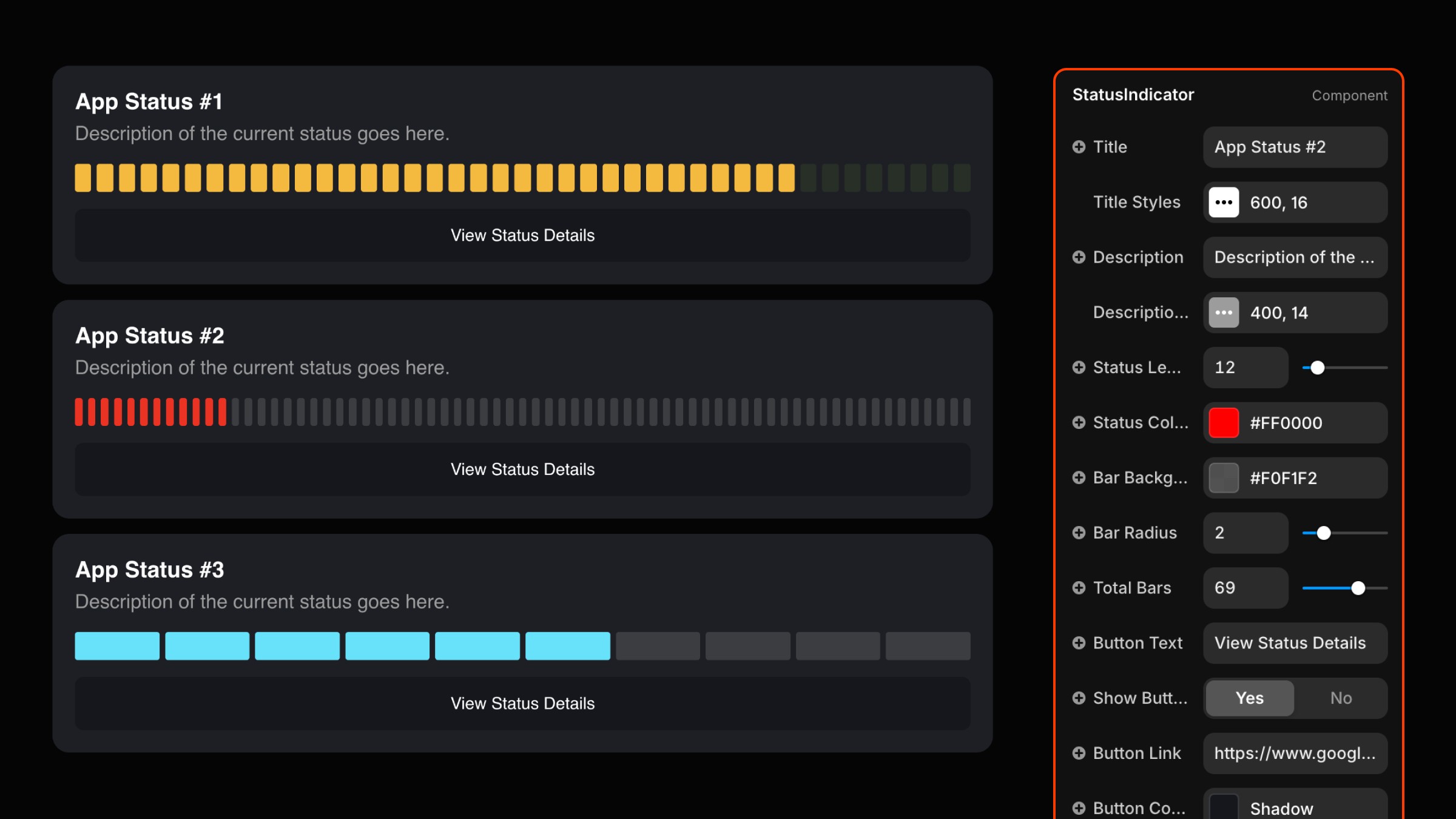
In the properties panel:
Title: Enter the heading text for your status.
Description: Provide a brief status summary.
Step 4: Customize Status Bars
Status Level: Adjust the active bars using the slider.
Total Bars: Set the number of bars (up to 100).
Status Color: Define the active bar color.
Bar Radius: Customize bar corner rounding.
Background Color: Choose the indicator background color.
Step 5: Adjust Button Settings
Edit Button Text, Button Color, and Hover Color.
Visibility: Toggle the button on/off.
Link Field: Add a destination link for the button.
Step 6: Style Typography
Title and description font styles, sizes, and colors are fully customizable.
Step 7: Add Hover Animation
Select hover transitions (instant, ease, or spring) with configurable timing.
Step 8: Preview and Finalize
Preview the design to verify the layout and animation. Fine-tune settings as needed.
Use Cases
This component is perfect for creating status pages to communicate website or app performance.

Hey, I'm James, Founder and Digital Product Designer at EMBK/STUDIO.
With over 15 years of experience, I've helped businesses transform their digital presence through stunning websites and smart, scalable design solutions.
